

Stylescapes: Visual Direction, Before Design
Creating visual directions for clients without heavy lifting.


Before we dive into pixels, we build alignment.
A Stylescape is a curated visual world. It’s a snapshot of your brand’s mood, tone, and aesthetic direction.
It bridges the gap between strategy and design, translating words like “bold,” “elegant,” or “futuristic” into something everyone can see and agree on.
Our process follows Chris Do’s proven framework: three curated visual directions (Hot, Medium, and Mild) that help clients choose how far to push their brand identity — before we commit to final design work.
The result? Fewer revisions, faster creative momentum, and crystal-clear visual alignment from day one.
Video
Purpose
To create a visual design direction before diving into full design — align you and the client on aesthetic language, reduce revisions, and speed up creative work. Stylescapes act as the “visual hypothesis” you test and agree on early.
Team Roles
Creative Lead / Designer – Builds and curates the stylescapes.
Brand Strategist / PM – Provides brand discovery input and ensures alignment with messaging.
Client (Stakeholder) – Reviews, gives feedback, picks direction.
Scope
This SOP applies when you’re doing brand identity, web design, app UI, or visual refresh work — wherever you need to set visual tone. It covers research → creation → presentation → approval of stylescapes.
Tools & Resources
Pinterest, Behance, Dribbble, Unsplash — for imagery & texture sourcing
Figma / Sketch / Adobe XD — to assemble stylescapes
Moodboard inspiration kits or photo libraries (e.g., UI8, Unsplash, Shutterstock)
Brand discovery documents (mission, values, audience, competitive references)
The Three C’s (Core Principles)
Chris frames Stylescapes around three pillars: Curation, Composition, Consistency (The Futur)
Curation: carefully selecting visual ingredients (images, fonts, textures)
Composition: arranging elements thoughtfully to communicate a mood / hierarchy
Consistency: applying unified visual logic (spacing, color harmony, typographic affinity)
Procedure
Step 1: Intake & Research
Review final Brand Discovery / Strategy doc (keywords, styles, audience, competitive visuals).
Ask “visual preference” questions with the client:
What visual examples do they love? (send 3–5 links)
What look/feel they dislike?
Keywords: modern, bold, minimal, energetic, moody, etc.
Create a visual inspiration board (scrapbook) offline or in Pinterest/Notion to collect images, textures, colors, typography references.
Step 2: Create 3 Flavors / Variations
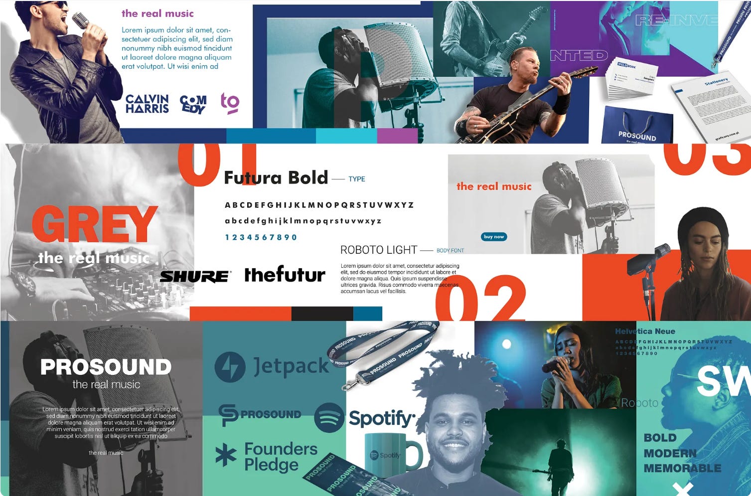
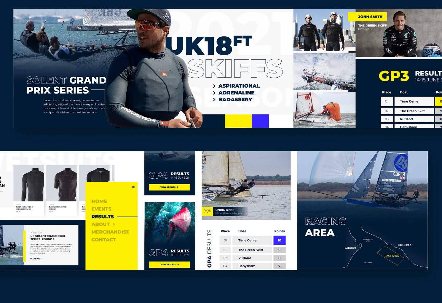
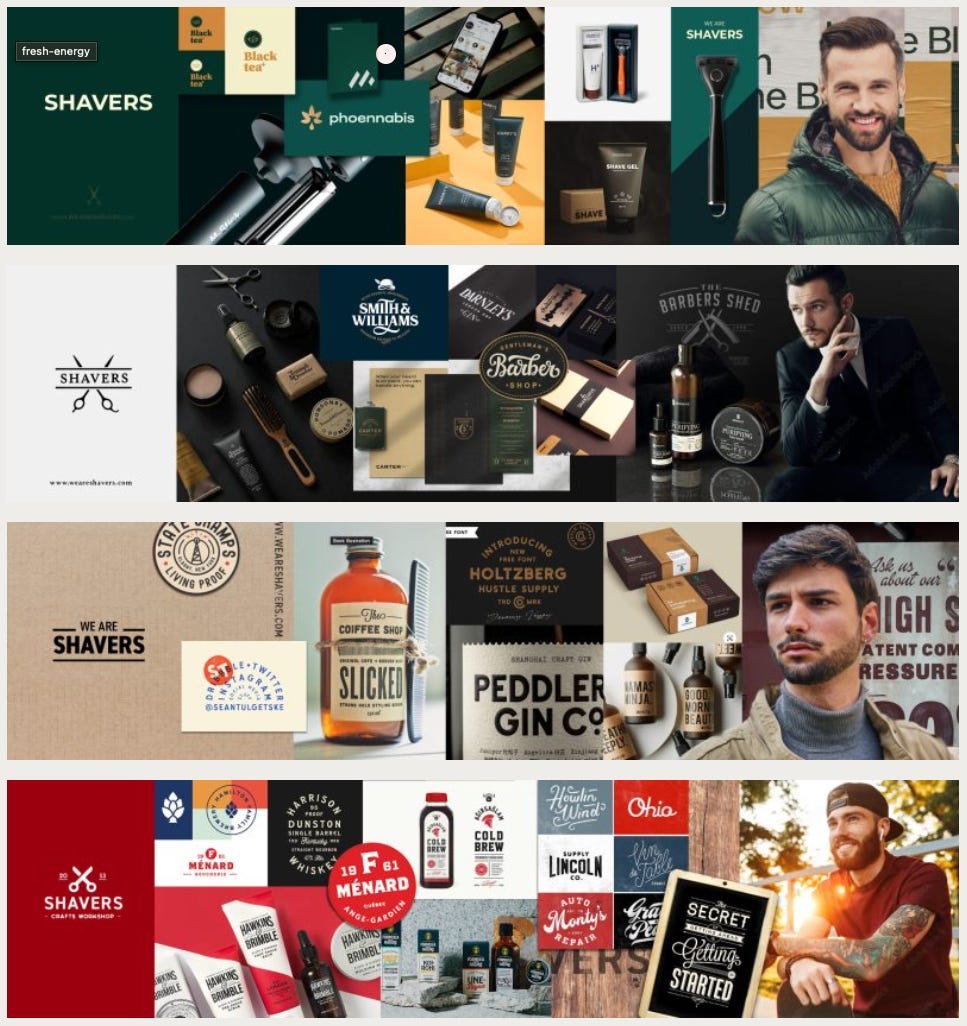
Chris recommends delivering three visual directions (Hot, Medium, Mild) to give contrast yet stay within brand boundaries. (The Futur)
Hot: bolder, more daring, edge-pushing version
Medium: closer to client expectations / the “safe bet”
Mild: restrained, subtle, softer tone
This gives the client meaningful choices and makes the decision easier.
Step 3: Build the Stylescapes
For each direction (Hot / Medium / Mild):
Set the Canvas
Use a large artboard (for example, 1920×1080 or 1600×900)
Add grid / margins to keep consistency across flavors
Place Key Visual Ingredients
Hero imagery (photos, illustration, textures)
Color swatches & gradients
Typography examples (headline, body, accents)
Graphic textures, patterns, UI treatments (buttons, shapes)
UI components or interface accents (if relevant)
Compose with Hierarchy & Flow
Make sure imagery, typography, color accents lead the eye
Use visual tension and balance to evoke emotion
Each direction should feel different, but still share brand DNA
Refine Consistency Across Elements
Color harmony (swatches should make sense across imagery)
Typography scales consistent
Spacing, padding, margins match across sections
Visual “edges” (rounded vs sharp), shadow logic, texture scale consistent
Step 4: Internal Review / Critique
Step back ~10 min, then review with fresh eyes
Ask: Which visuals “pop”? Which feel off?
Adjust contrast, remove weak visuals, refine alignment
Ensure each flavor is distinct but credible
Step 5: Present to Client
Preface with a short narrative: “Here are three visual directions that reflect your brand — each explores a unique energy.”
Walk through each stylescape: point out logo feel, color mood, imagery, typographic character
Ask guided questions:
Which direction resonates most?
What feels strong? What feels weak?
Would you like combinations or tweaks?
Collect feedback and confirm which flavor(s) to refine
Step 6: Lock Direction & Build Out
Once client approves a direction, consolidate that into a master stylescape version (final).
Use that master stylescape as the visual guide: design mockups, interface, collateral all refer back to it
Archive all flavors & decision notes for reference
Expected Outcomes
Client & team aligned visually before detailed design work
Faster design execution with fewer surprises
Stronger confidence from the client — they’ve “seen it first”
Clear visual guide that drives downstream design consistency